Overview
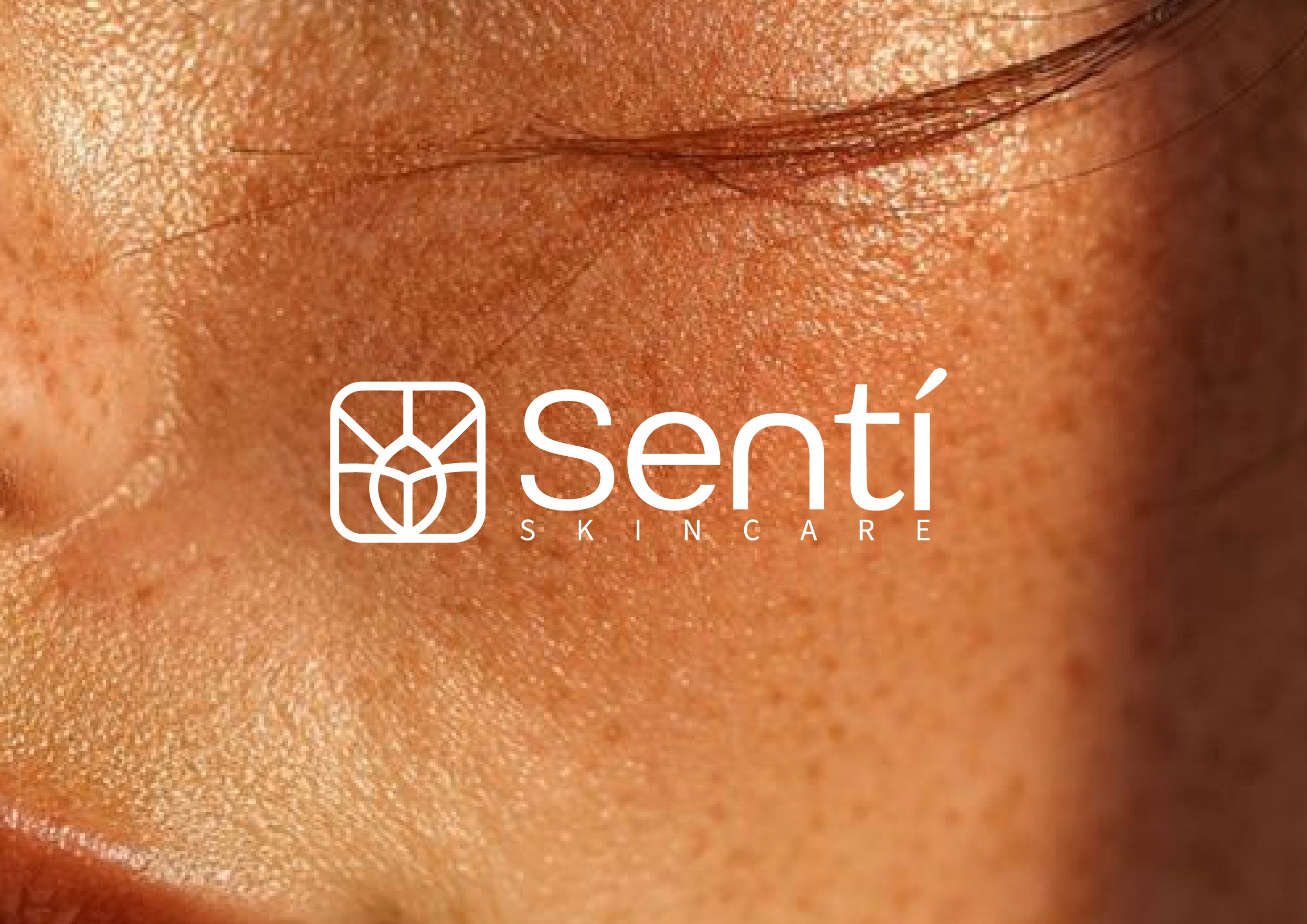
The project consisted of building a strong and long-lasting identity for a K-Beauty brand, understood not only as a product marketplace but as a skincare ritual. The proposal was based on references to ancient symbolic languages, signs, and essential gestures, reinterpreted through a contemporary, clean, and sensorial approach.
Industry
Cosmetic
Service
Brand Identity
Digital Design
Logo

The Challenge
The main challenge was to design an icon that did not rely on passing trends or literal symbols, but instead condensed abstract concepts such as freshness, connection, and light into a simple, recognizable, and versatile form. Additionally, the symbol needed to function as the central axis of the brand system, adaptable to multiple applications and scalable over time.

The Solution
A symbol inspired by primitive signs and ancestral languages was developed, prioritizing formal synthesis, sensitivity in line work, and visual balance. The result is an icon that is felt rather than explained, capable of conveying clarity, calmness, and soft energy, aligned with the philosophy of progressive skincare inherent to Korean cosmetics.

The Result
The elegant packaging and refined digital design significantly enhanced HydraLips’ brand recognition and customer engagement. The new packaging attracted more customers in retail environments, while the improved digital presence boosted online interactions and sales. Overall, HydraLips successfully established a strong, memorable brand identity in the competitive beauty market.


PORTFOLIO
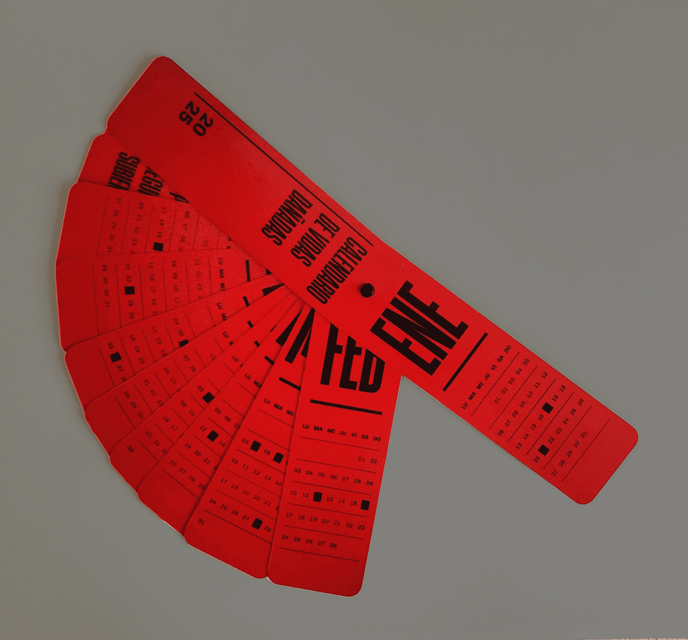
Invisibilizadas
Invisibilizadas
Invisibilizadas

Editorial
Web
Digital Design
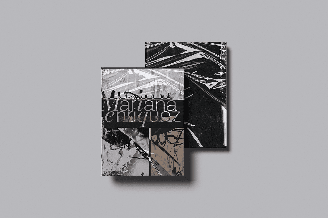
Experimental Book
Experimental Book
Experimental Book
Editorial design
Typography
Concept
Digital Design